Branding the Cape Town chapter of a huge global movement like Maker Faire is such a fun challenge. The big question was: how do we make it feel instantly recognizable to fans worldwide, but also uniquely and proudly Capetonian?
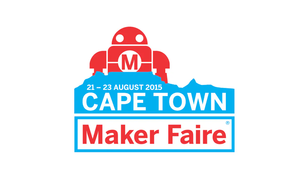
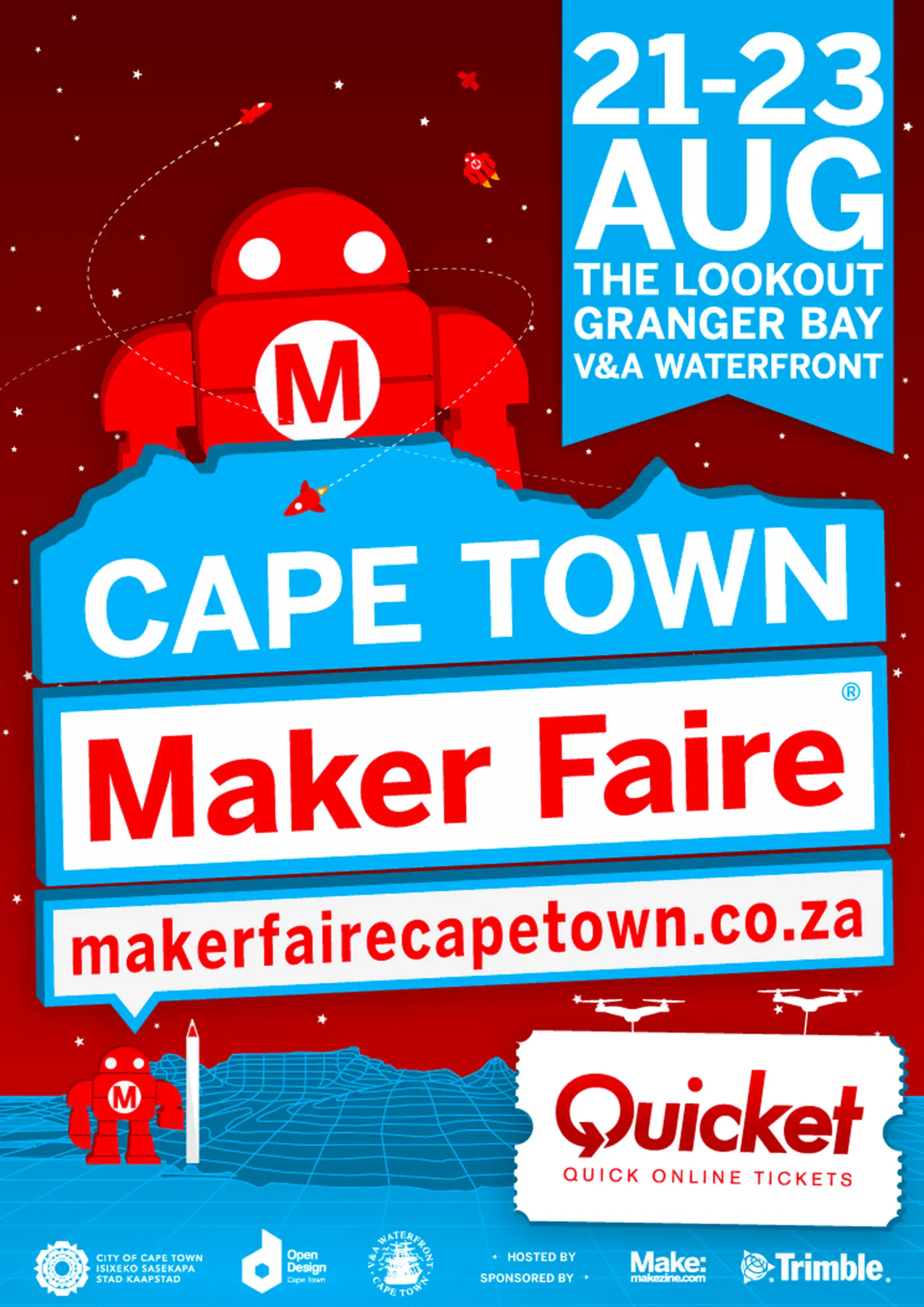
We started by embracing the core elements everyone knows and loves, keeping the iconic "Maker Faire red" and the playful 'Makey' robot mascot at the heart of the identity. You can see Makey proudly sitting atop the Table Mountain silhouette in the logo, immediately rooting it in Cape Town. This was our anchor, making sure we felt like a true part of the international family. But then came the fun part: weaving in the Cape Town flavour. For the event poster, I illustrated a whimsical, futuristic landscape with smaller Makey robots exploring, rockets, and even a red crescent moon, blending the spirit of invention with a fantastical local touch. This blended identity was rolled out across everything, from the main logo and vibrant social media to all the on-the-day event collateral, giving our local maker community an event that felt both world-class and wonderfully their own.
We started by embracing the core elements everyone knows and loves, keeping the iconic "Maker Faire red" and the playful 'Makey' robot mascot at the heart of the identity. You can see Makey proudly sitting atop the Table Mountain silhouette in the logo, immediately rooting it in Cape Town. This was our anchor, making sure we felt like a true part of the international family. But then came the fun part: weaving in the Cape Town flavour. For the event poster, I illustrated a whimsical, futuristic landscape with smaller Makey robots exploring, rockets, and even a red crescent moon, blending the spirit of invention with a fantastical local touch. This blended identity was rolled out across everything, from the main logo and vibrant social media to all the on-the-day event collateral, giving our local maker community an event that felt both world-class and wonderfully their own.